Project Overview
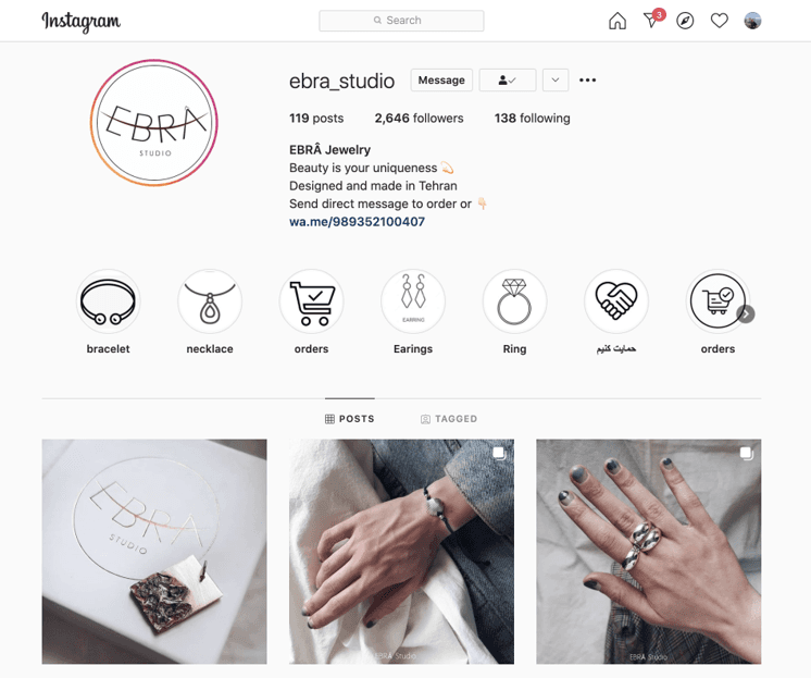
Ebra Studio emerges as a distinctive entity within the Canadian market, spotlighting its commitment to the art of jewelry making. Founded by Farimah, Ebra stands as a beacon of sustainability, quality, and women empowerment. Specializing in minimal silver jewelry and decorative silver artifacts, Farimah sought to extend her local business reach nationally via a responsive web presence, leveraging both website and mobile platforms for enhanced market penetration and sales dynamics.
The problem statement
Business Analysis
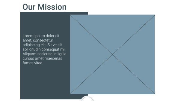
Ebra Studio needs a responsive, user-friendly website to transition from local to national presence, showcasing its sustainable, artisanal jewelry while enhancing user experience and accessibility.
Ebra Studio seeks to expand its reach from a local to a national audience in Canada by developing a responsive website that mirrors its values of sustainability, quality, and women empowerment. The core challenge is crafting an intuitive and accessible online shopping experience that showcases their minimal silver jewelry and artifacts effectively. The solution must bridge the gap between Ebra's artisanal ethos and the digital marketplace, ensuring a seamless user journey for a diverse customer base.
Stakeholder Interviews
Conversations with stakeholders to gather insights on the studio's vision, target users, materials, and operational details.
A demand for categorizing jewelry for easier selection.
The importance of high-quality photos and detailed product information.
The value of user reviews in establishing trust.
The need for a clean and straightforward web design.
Key Findings
Focus on a minimal design that reflects the brand's ethos.
Ensure easy access to detailed product information and ordering process.
Enhance website accessibility through specific design elements.
Key Findings
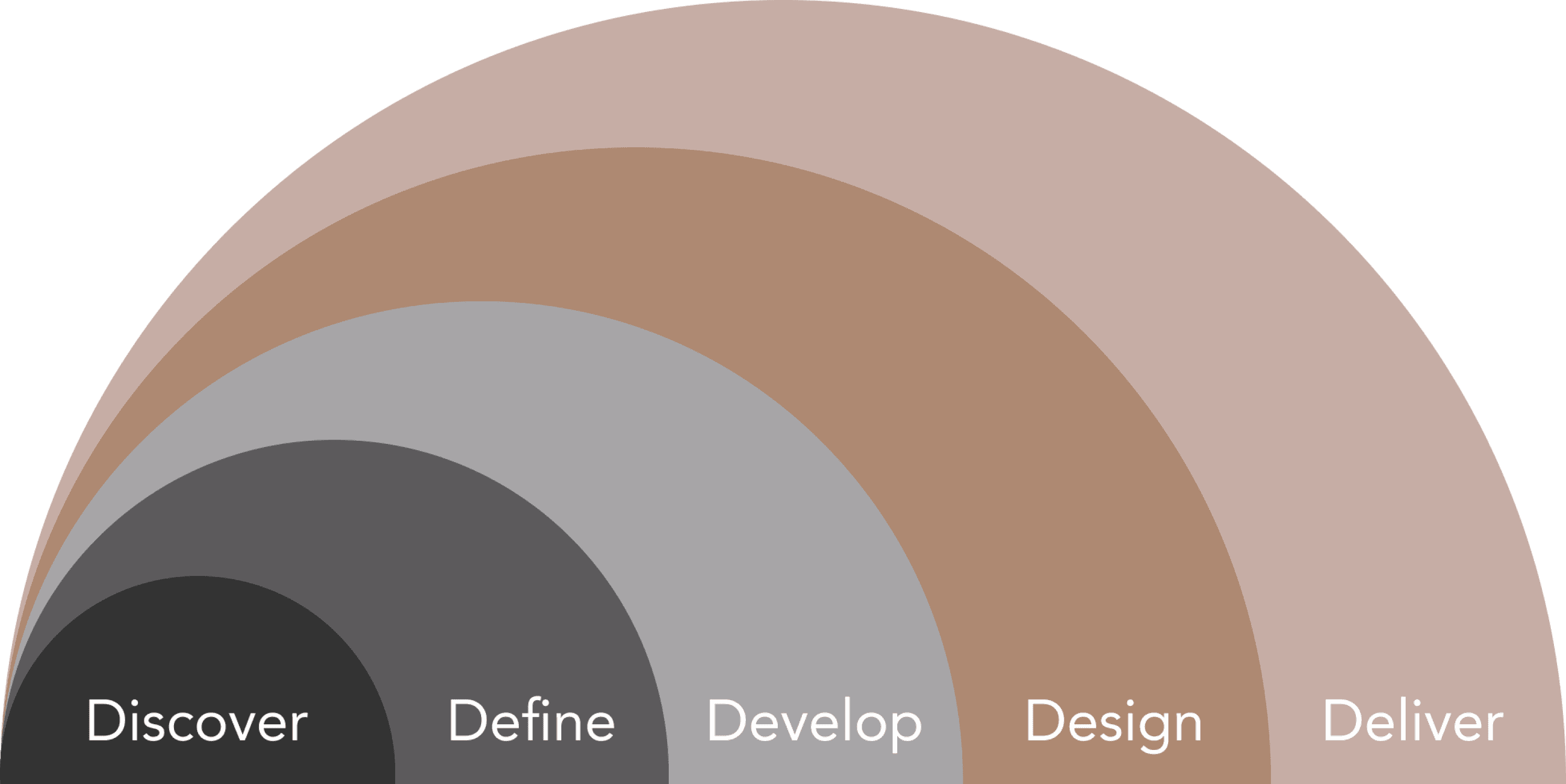
Discover

Business research
Competitive analysis
Persona
Storytelling
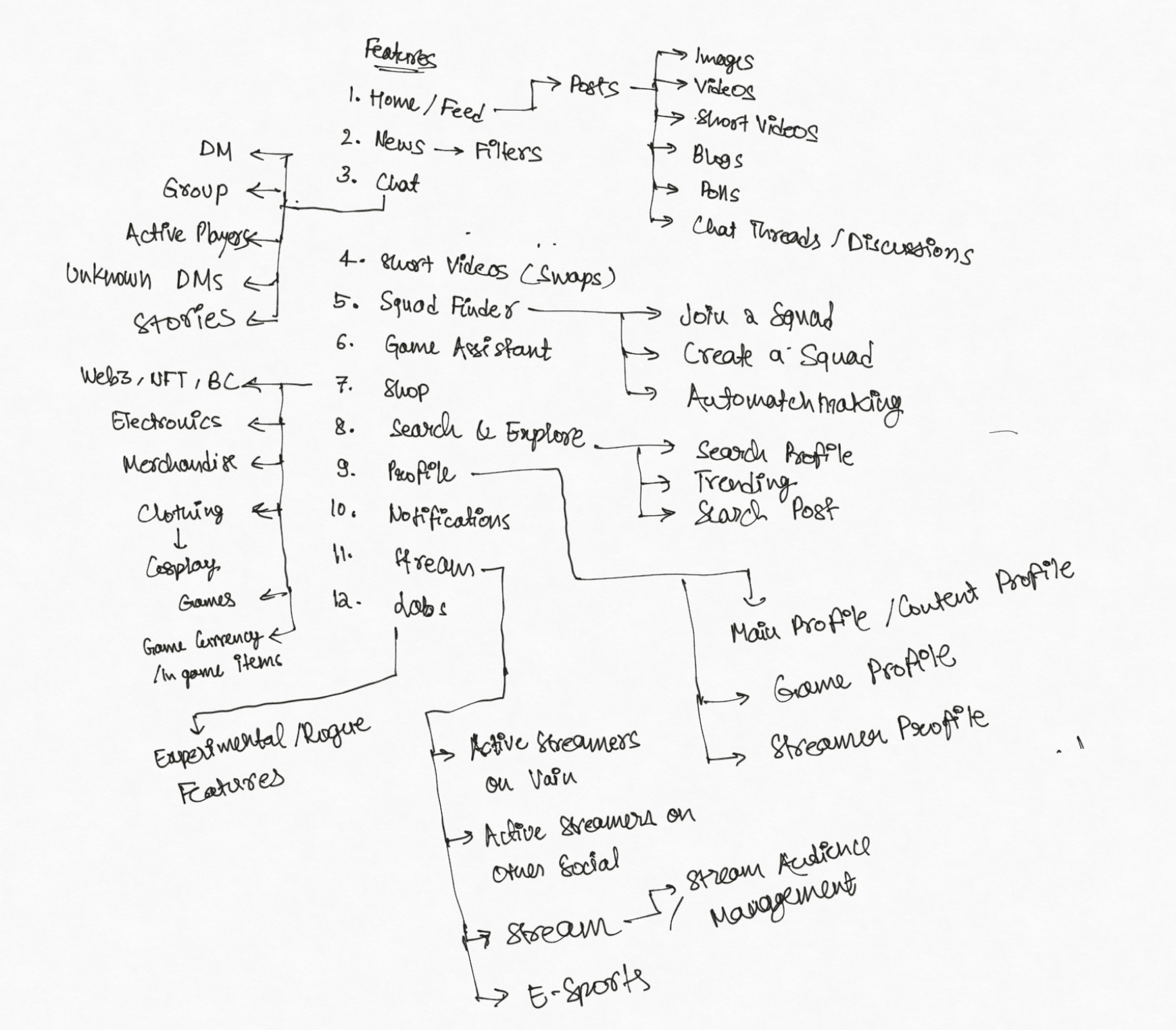
Information architecture
Site map
User flow
Ideate, Sketch
Moodboard
User testing
UI kit
Clickable prototype
User Interviews
Engagement with potential users to understand their experiences, preferences, and frustrations when buying jewelry online.


Define
Unique Brand Proposition
Artisanal Expertise
Women Empowerment
Competitive Market
Rapid Technological Changes
Economic Uncertainties
Digital Presence Transition
Market Penetration:
Resource Limitations
Strengths
Weaknesses
Opportunities
Threats
Growing Eco-Conscious Market
Digital Marketing and Social Media
Collaborations and Partnerships
SWOT Analysis
Ebra Studio’s SWOT analysis highlights its strong position based on unique product offerings and ethical values. However, navigating the challenges of digital expansion, market competition, and technological advancements are crucial for achieving national presence and sustainable growth.
Persona Development
Creation of user personas, such as Faranak, to guide the design process based on targeted user needs and behaviors.
Scenario and Storyboarding
Crafting scenarios based on user personas to visualize their journey and interactions with the website.
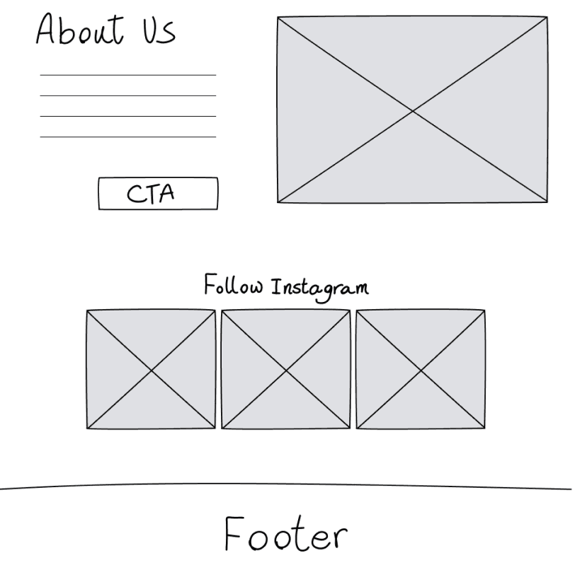
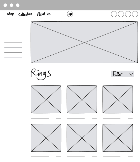
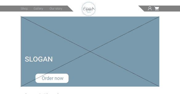
Sketches and Wireframing
Development of low-fidelity wireframes to explore different design concepts and layouts, followed by high-fidelity prototypes to refine the user interface and experience.
User Testing Iteration
Final Design
Moodboard
Future Steps
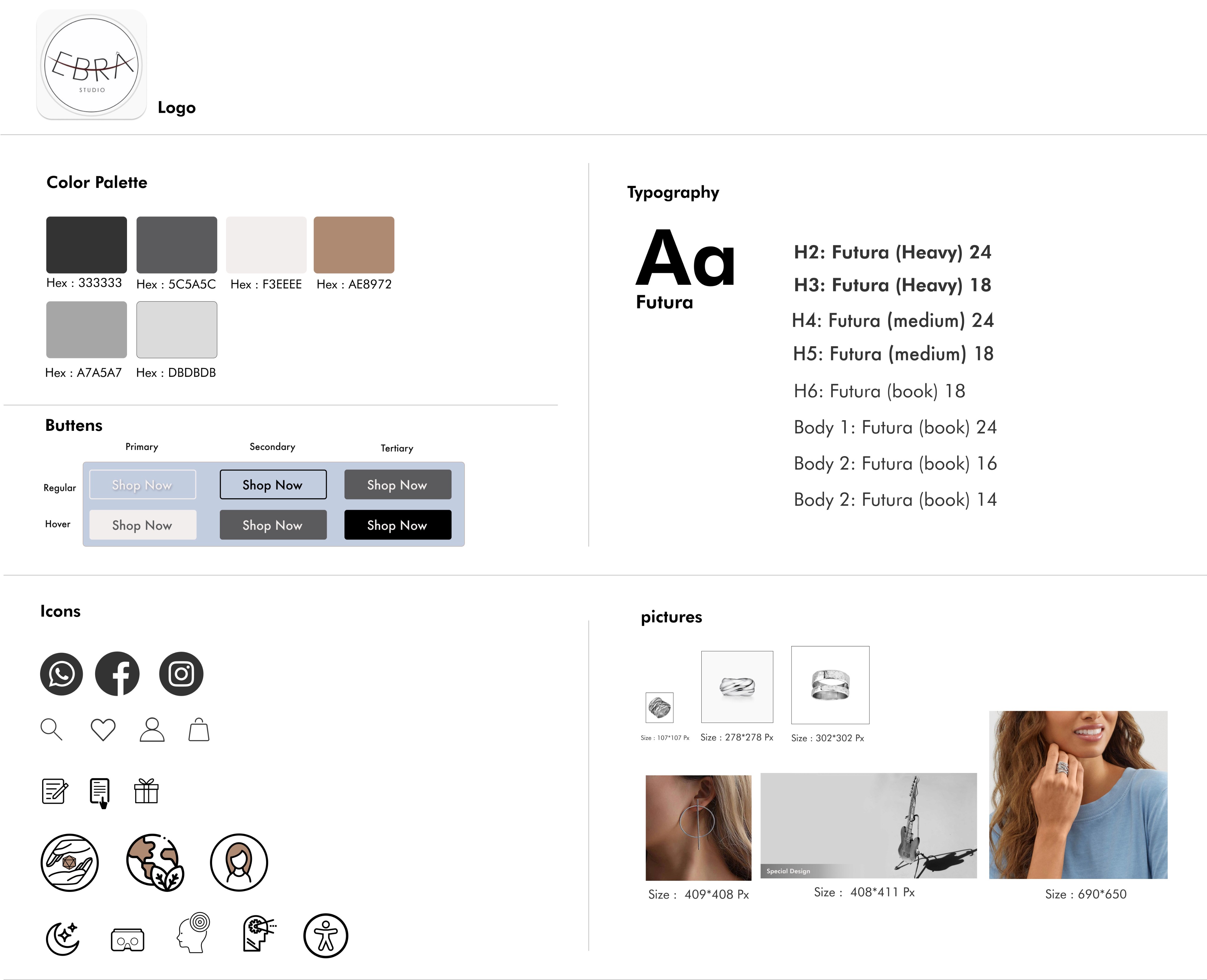
UI Kit
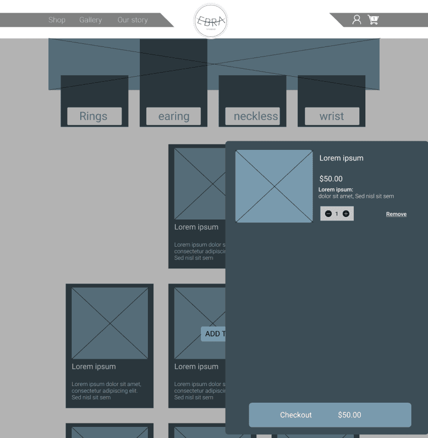
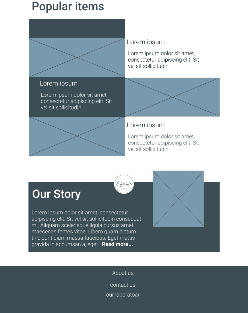
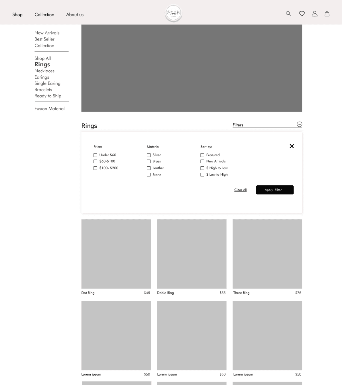
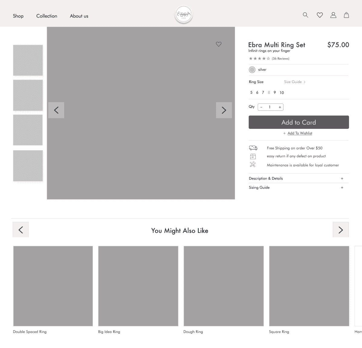
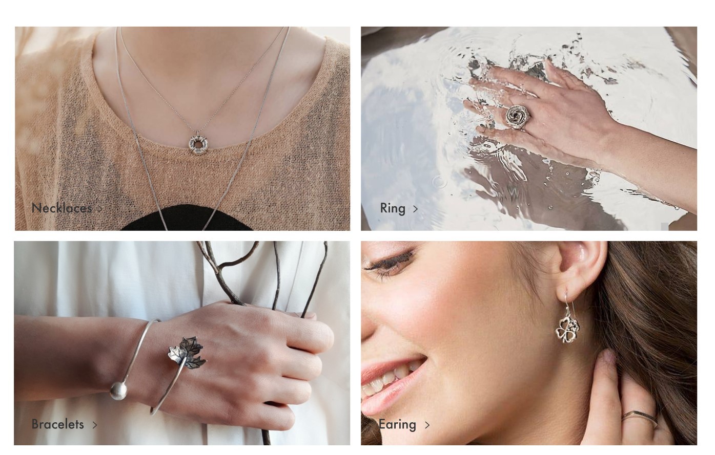
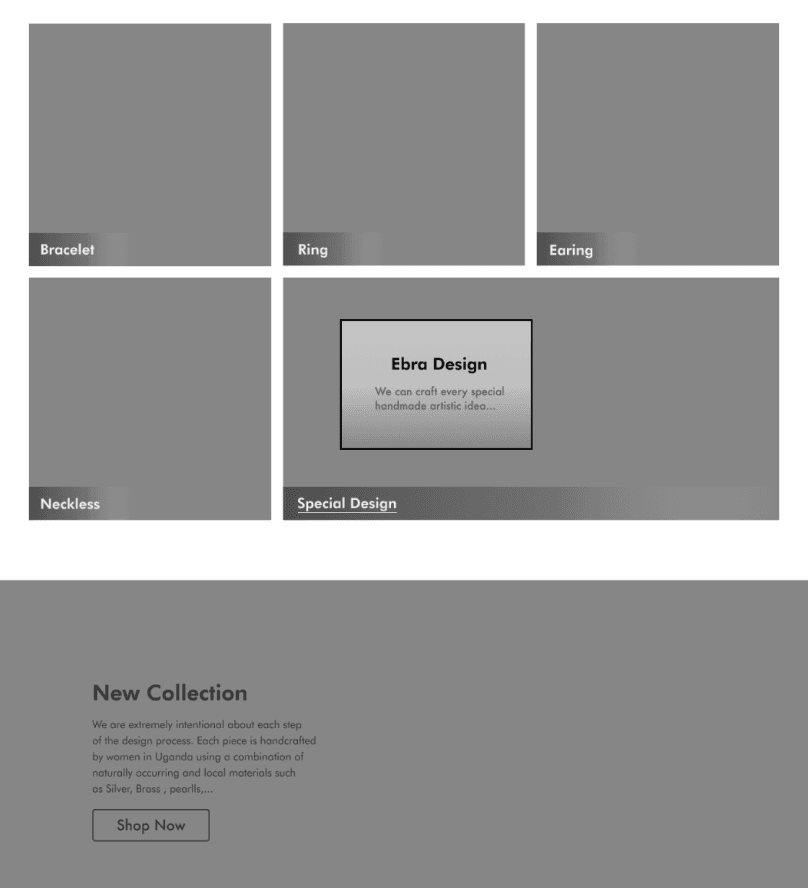
One of the significant challenges our team faced was categorizing the products. Before finalizing the information architecture, we identified four main product types, in addition to a special category for unique custom orders. Initially, we designed these four product categories as a secondary banner to ensure they were immediately visible to customers. This section was enriched with various micro-interactions to enhance user engagement and convey our passion for this project.
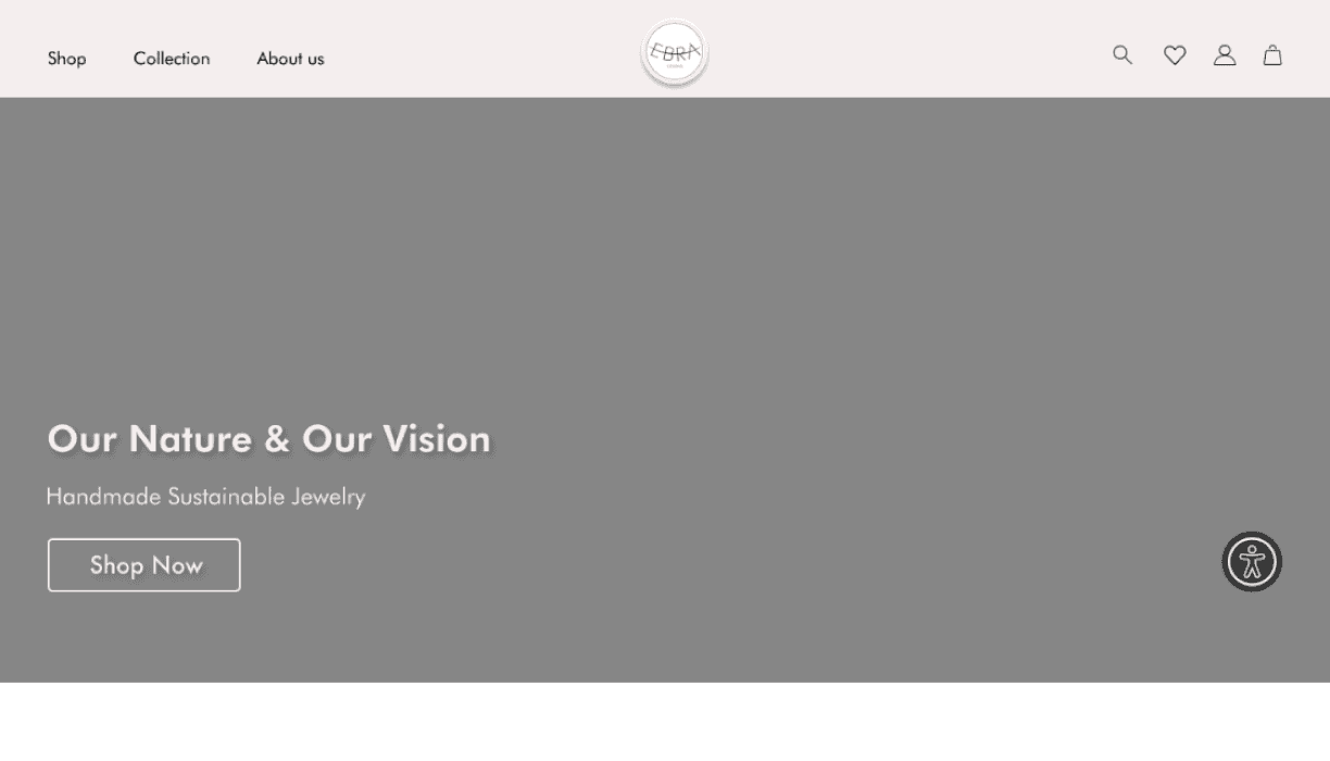
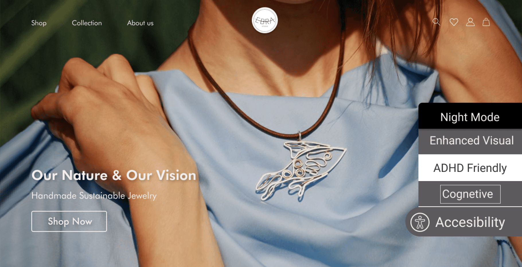
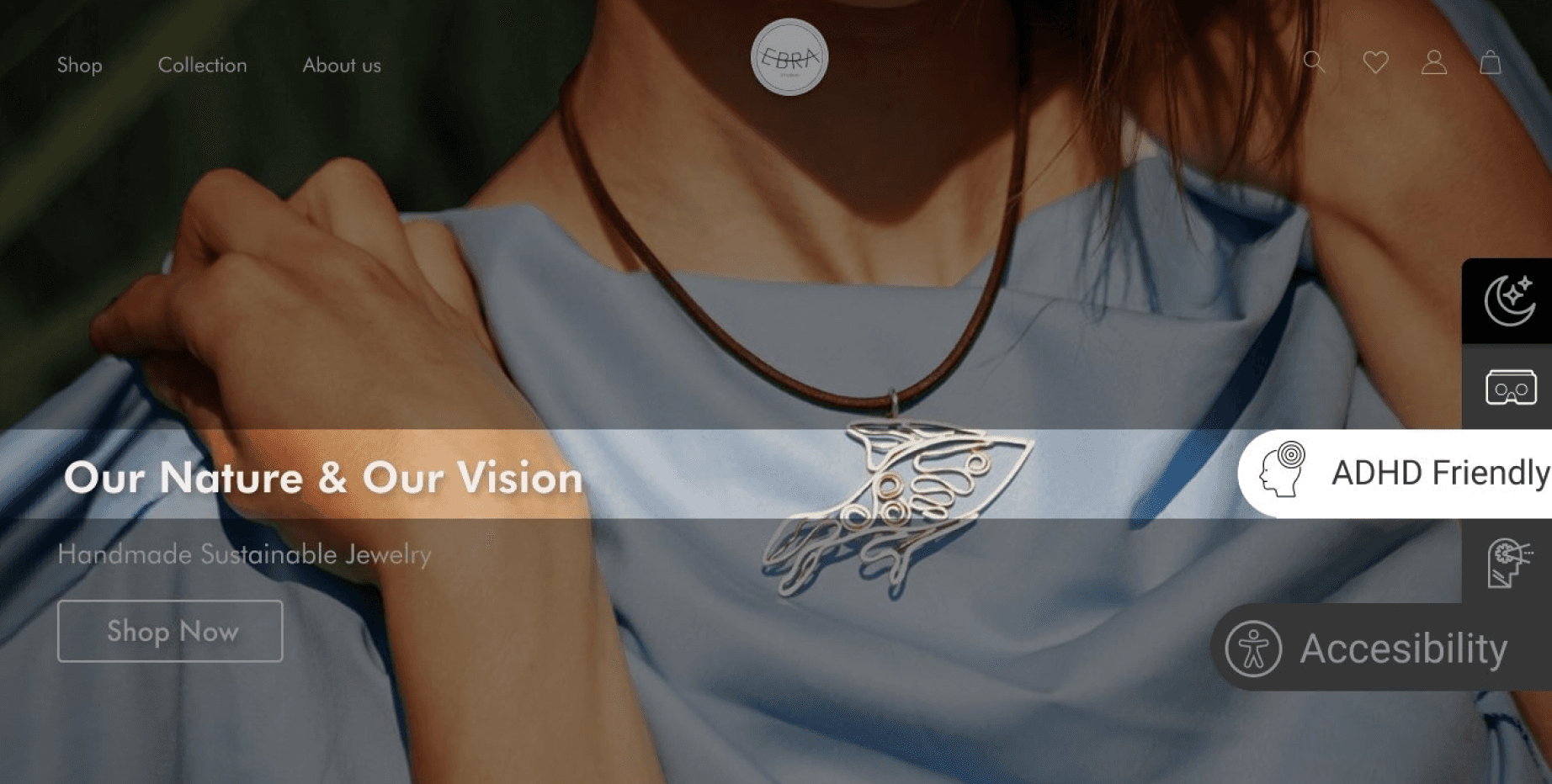
During our academic exploration, we delved into the needs of a diverse user base requiring specialized accessibility options for our website. Engaging with stakeholders led to a consensus on enhancing the site's accessibility features. Initially inclined to mimic a competitor's accessibility panel—a purchasable service aimed at augmenting accessibility in a style akin to certain reference images—we encountered a pivotal insight from our mentor. He illuminated a critical flaw: users with disabilities faced difficulties in navigating the competitor's system to find the appropriate accessibility profile. This feedback prompted a strategic pivot towards a design that emphasized intuitiveness and ease of use, mirroring the more accessible and user-friendly layout depicted in an alternate image, thereby prioritizing seamless accessibility for all users.
Reflecting on this project, I've gleaned pivotal insights. The shift towards micro-interactions proved transformative, enhancing user engagement significantly. This adjustment illuminated the crucial balance between functionality and user experience.
A profound realization emerged regarding inclusivity; understanding that approximately one billion individuals live with disabilities underscored the importance of accessible design. This insight shifted my perspective from mere compliance to a deeper commitment to respect and cater to all users' needs.
Questioning the status quo, particularly regarding accessibility solutions, was enlightening. It highlighted the necessity of pursuing approaches that genuinely meet users' needs rather than defaulting to existing, potentially inadequate solutions.
Looking forward, the project points towards further research into accessibility and the exciting potential of Augmented Reality (AR) for immersive product interactions. These directions promise to enhance user experiences and inclusivity, aligning technology more closely with user needs.
Looking ahead, the project points me towards two main directions. Firstly, there's a clear need to delve deeper into research and ideation around accessibility profiles, aiming to further refine and enhance the experience for users with disabilities. Secondly, if my involvement with the team continues, I'm eager to explore the potential of Augmented Reality (AR) for product interactions. This technology could revolutionize how users engage with products, offering an immersive experience that closely mimics physical interaction, thereby bridging the gap between digital and tangible experiences.
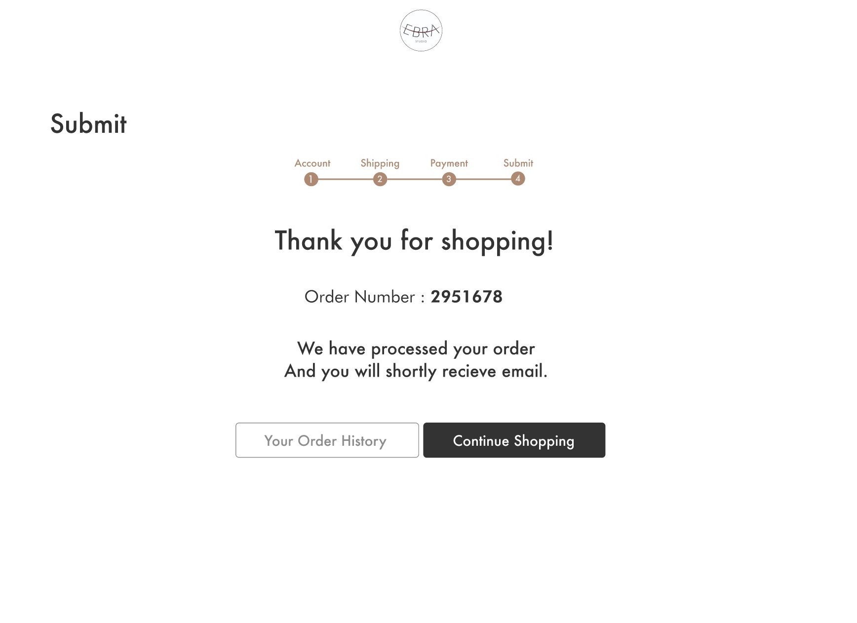
Ultimately, the team decided to incorporate a banner for the unique custom orders alongside the existing categories to draw more attention to this option, ensuring that users could easily find whatever product they were searching for. This addition marks the completion of our final design
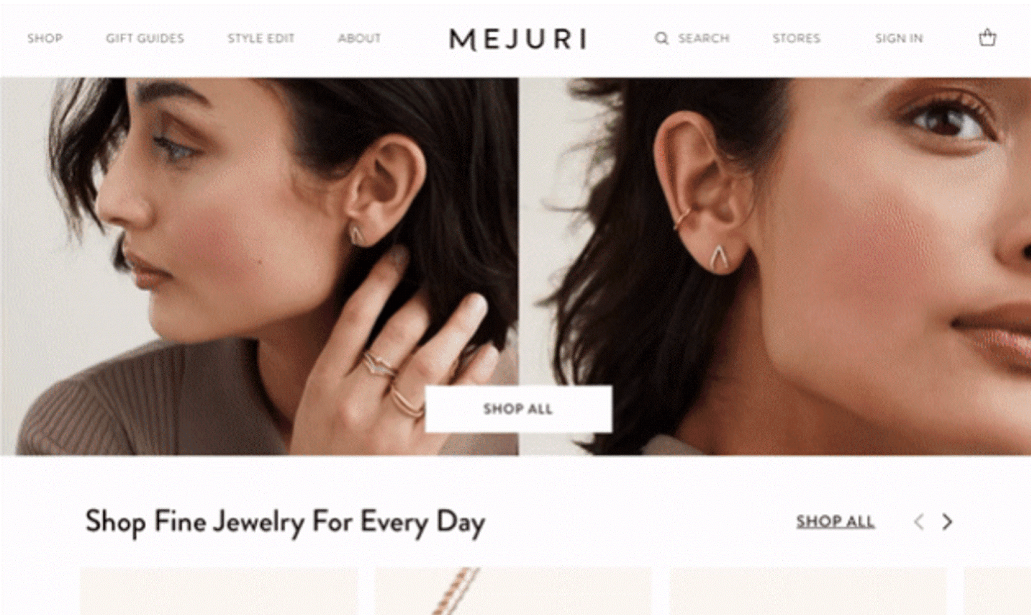
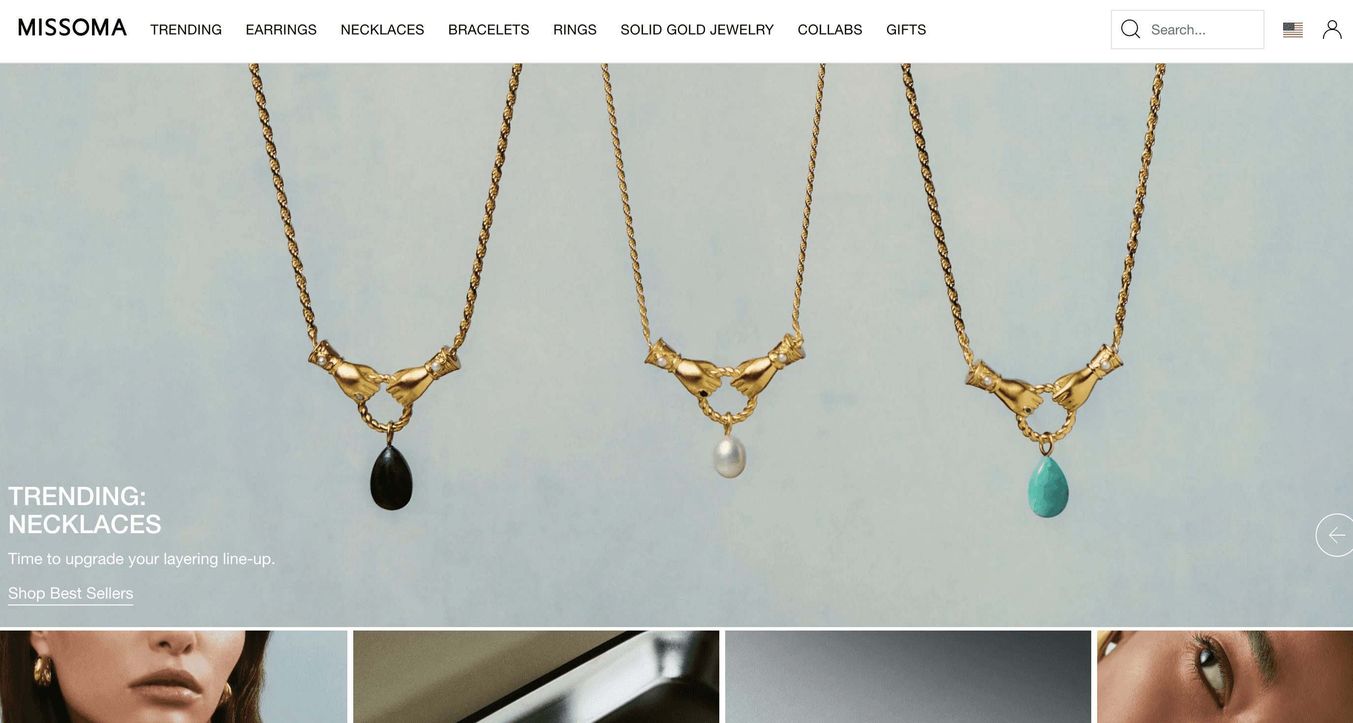

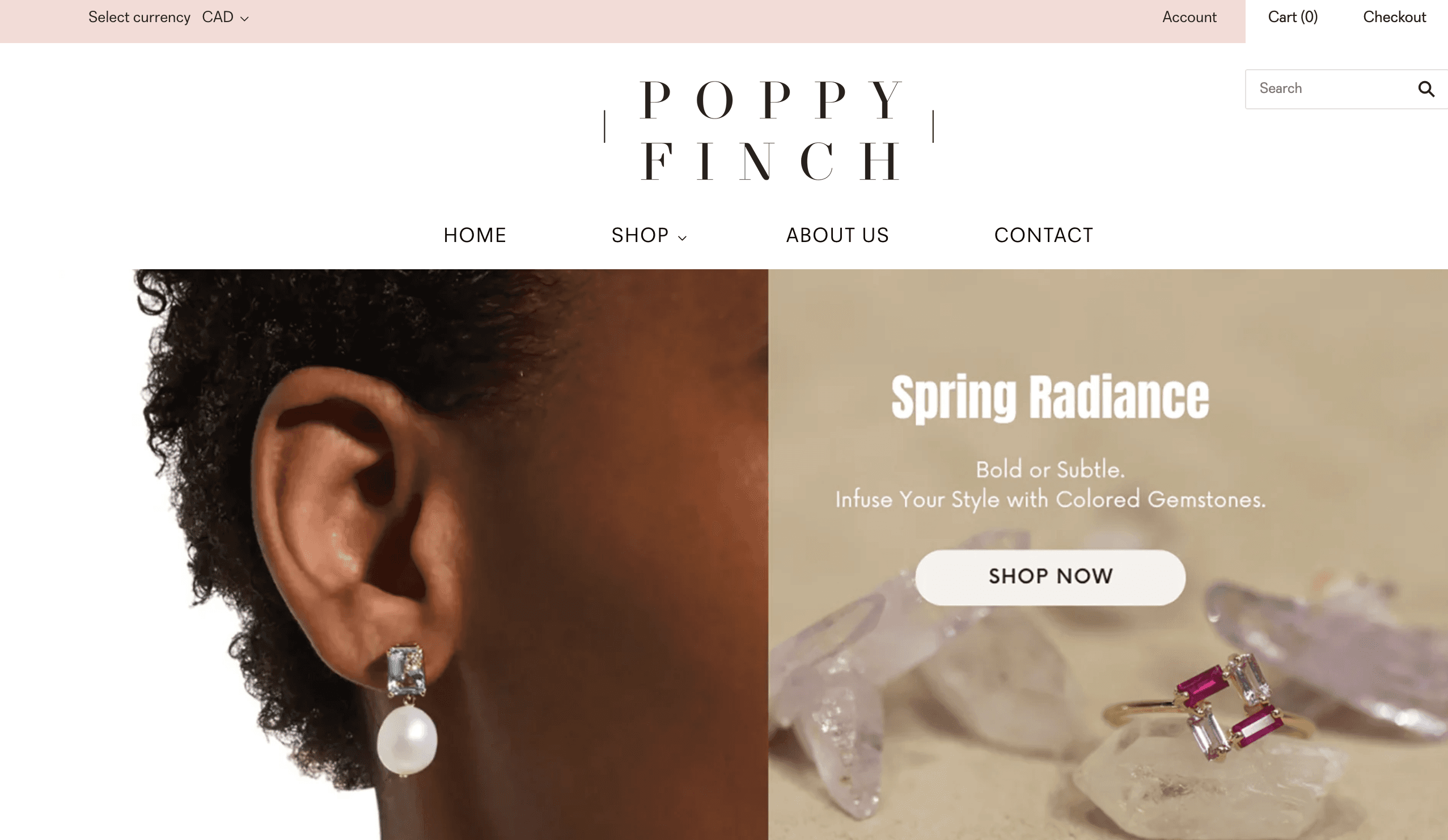

Comparative and Competitive Analysis
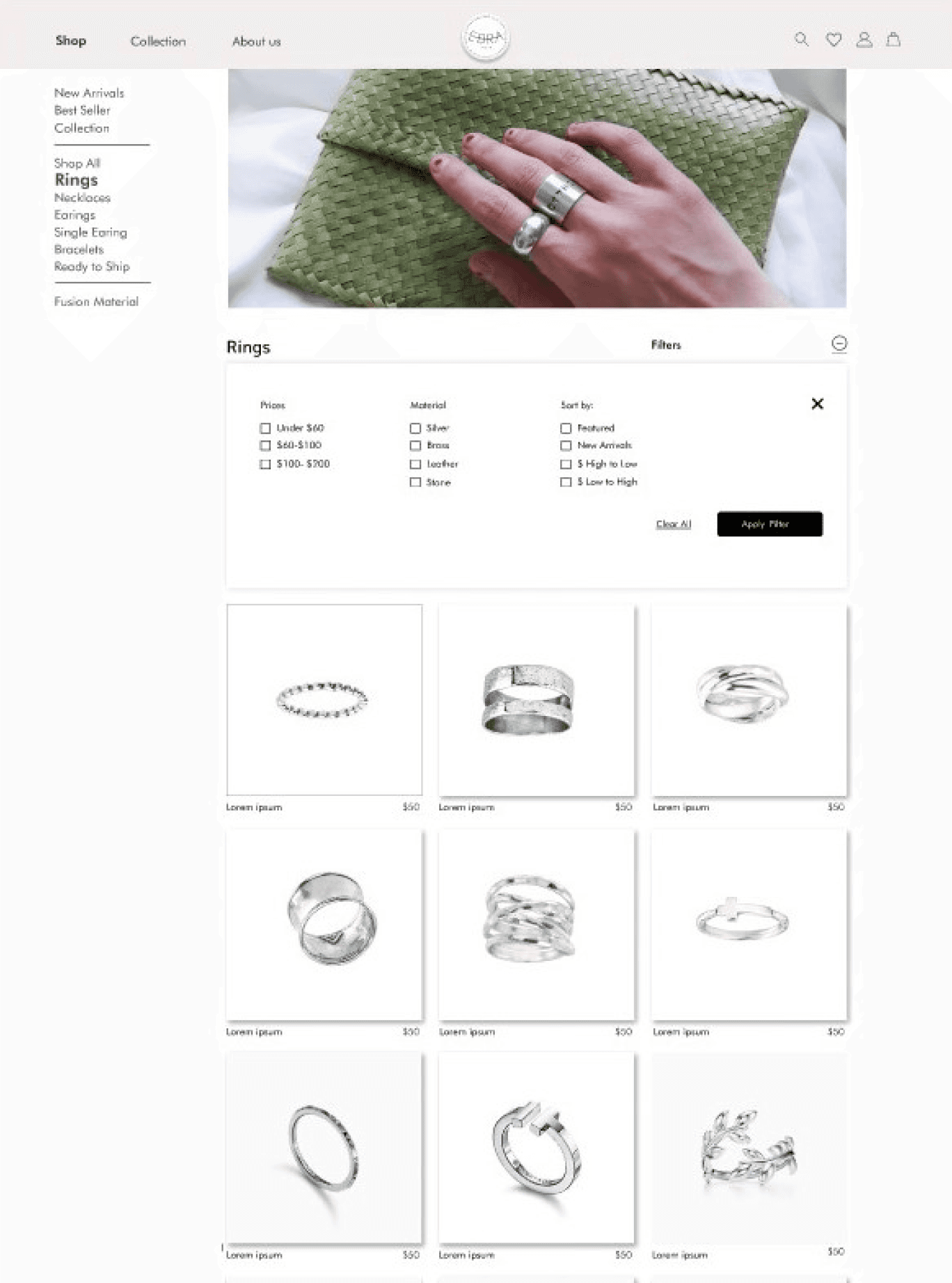
Examination of competitor websites to identify common features and best practices in jewelry website design.
Card Sorting and Site Map
To organize Ebra Studio's website content in a way that enhances user navigation and experience, ensuring that visitors can intuitively find information and products. This helped us define the information architecture of the website, focusing on categories, navigation menus, and product placements. Following the card sorting, we develop the site map.

is a full-time student. She has been living in Vancouver for more than three years. She is interested in handmade jewelry while supporting local branding, women's business, and sustainable products. One of her habits is spending time on social media such as Pinterest and Instagram to see the jewelry trend.
Faranak
Mindset
Love the earth
GirlPower
Handcraft lover
Jewelry lover
Support Local branding
Frustration
Not having enough time to buy things in person
Inflexible university courses
Goal
Support local branding
Start her own business
Ability to show her art
Jewelry is something that has to do with emotion. The aspect of Jewelry really interest me
25 years old
Media Art Student
Vancouver
Single
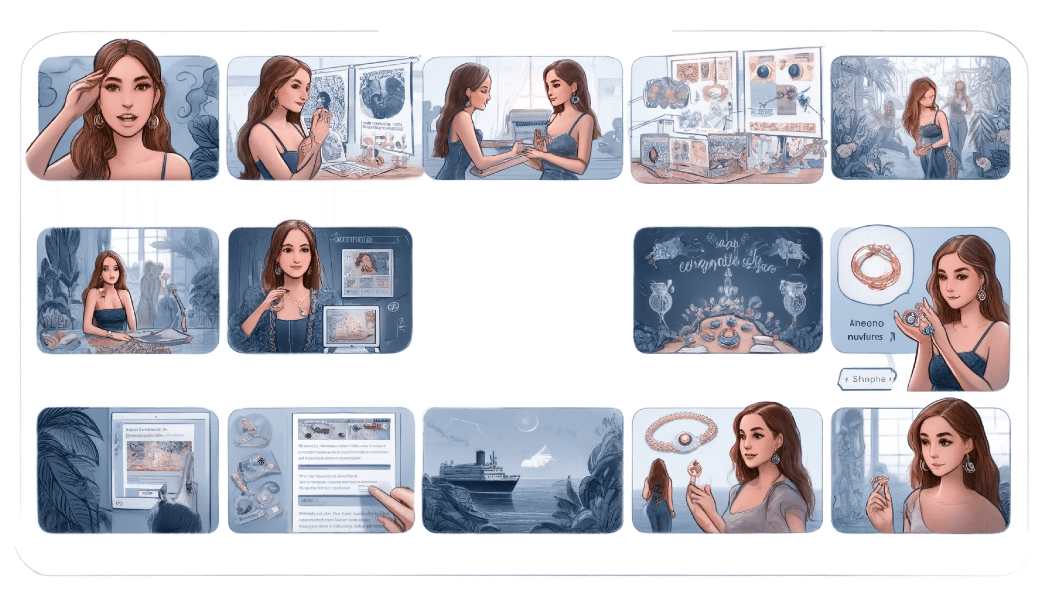
Faranak’s Scenario


Develop
Deliver
View Prototype
Reflection
Plugin Designed:

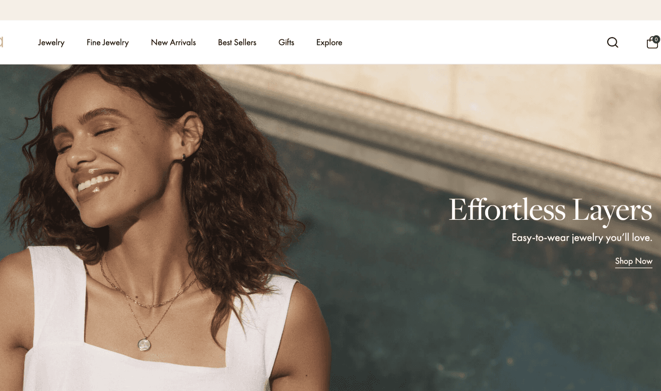
Our Minimal Design:


Micro-interactions enhances user engagement.
Simplicity and subtle interactions significantly impact engagement.
Urges seeking solutions that truly meet user needs.
Valuing all users beyond adhering to accessibility standards.
Fostering inclusivity is crucial for around one billion people.

Ebra Studio
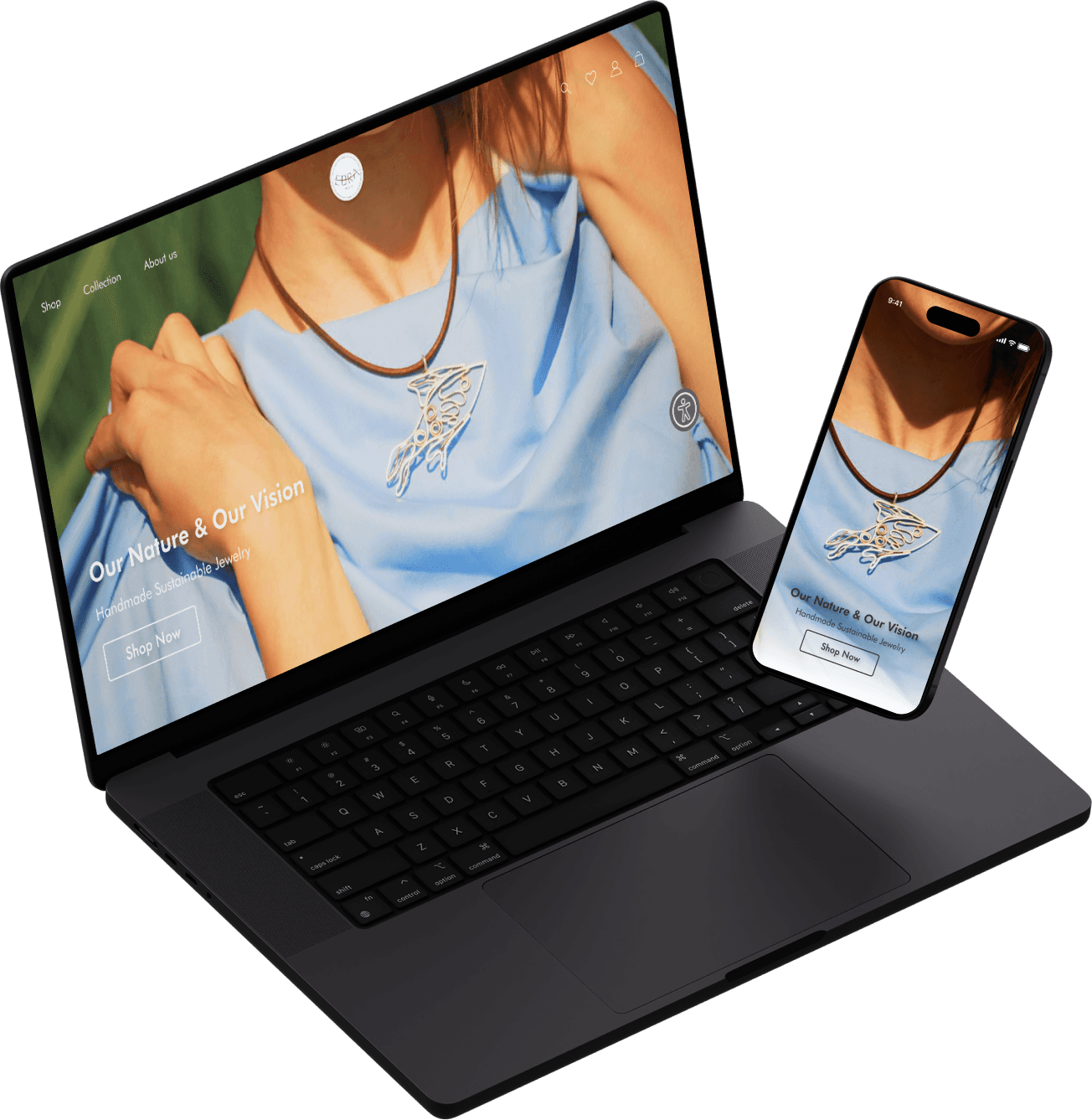
Responsive design for a sustainable jewelry

View Prototype

Project Overview
Ebra Studio emerges as a distinctive entity within the Canadian market, spotlighting its commitment to the art of jewelry making. Founded by Farimah, Ebra stands as a beacon of sustainability, quality, and women empowerment. Specializing in minimal silver jewelry and decorative silver artifacts, Farimah sought to extend her local business reach nationally via a responsive web presence, leveraging both website and mobile platforms for enhanced market penetration and sales dynamics.
The problem statement
Ebra Studio needs a responsive, user-friendly website to transition from local to national presence, showcasing its sustainable, artisanal jewelry while enhancing user experience and accessibility.
Business research
Competitive analysis
Persona
Storytelling
Information architecture
Site map
User flow
Ideate, Sketch
Moodboard
User testing
UI kit
Clickable prototype
Business Analysis
Ebra Studio seeks to expand its reach from a local to a national audience in Canada by developing a responsive website that mirrors its values of sustainability, quality, and women empowerment. The core challenge is crafting an intuitive and accessible online shopping experience that showcases their minimal silver jewelry and artifacts effectively. The solution must bridge the gap between Ebra's artisanal ethos and the digital marketplace, ensuring a seamless user journey for a diverse customer base.
Stakeholder Interviews
Conversations with stakeholders to gather insights on the studio's vision, target users, materials, and operational details.
Discover
User Interviews
Engagement with potential users to understand their experiences, preferences, and frustrations when buying jewelry online.
A demand for categorizing jewelry for easier selection.
The importance of high-quality photos and detailed product information.
The value of user reviews in establishing trust.
The need for a clean and straightforward web design.
Key Findings
Define
SWOT Analysis
Ebra Studio’s SWOT analysis highlights its strong position based on unique product offerings and ethical values. However, navigating the challenges of digital expansion, market competition, and technological advancements are crucial for achieving national presence and sustainable growth.
Growing Eco-Conscious Market
Digital Marketing and Social Media
Collaborations and Partnerships
Competitive Market
Rapid Technological Changes
Economic Uncertainties
Weaknesses
Strengths
Opportunities
Threats
Unique Brand Proposition
Artisanal Expertise
Women Empowerment
Digital Presence Transition
Market Penetration:
Resource Limitations
Persona Development
Creation of user personas, such as Faranak, to guide the design process based on targeted user needs and behaviors.
is a full-time student. She has been living in Vancouver for more than three years. She is interested in handmade jewelry while supporting local branding, women's business, and sustainable products. One of her habits is spending time on social media such as Pinterest and Instagram to see the jewelry trend.
Faranak
Mindset
Love the earth
GirlPower
Handcraft lover
Jewelry lover
Support Local branding
Frustration
Not enough time for in-person shopping
Inflexible university courses
Goal
Support local branding
Start her own business
Ability to show her art
Jewelry is something that has to do with emotion. The aspect of Jewelry really interest me
25 years old
Media Art Student
Vancouver
Single

Comparative and Competitive Analysis
Examination of competitor websites to identify common features and best practices in jewelry website design.
Card Sorting and Site Map
To organize Ebra Studio's website content in a way that enhances user navigation and experience, ensuring that visitors can intuitively find information and products. This helped us define the information architecture of the website, focusing on categories, navigation menus, and product placements. Following the card sorting, we develop the site map.

Enhance website accessibility through specific design elements.
Focus on a minimal design that reflects the brand's ethos.
Ensure easy access to detailed product information and ordering process.
Key Findings
Scenario and Storyboarding
Crafting scenarios based on user personas to visualize their journey and interactions with the website.

Faranak's Scenario
Develop
Sketches and Wireframing
Development of low-fidelity wireframes to explore different design concepts and layouts, followed by high-fidelity prototypes to refine the user interface and experience.


User Testing Iteration
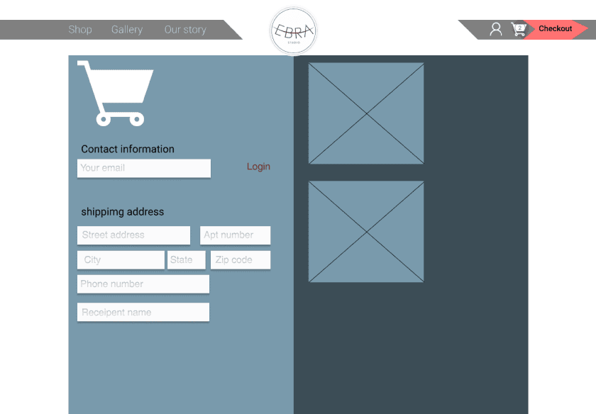
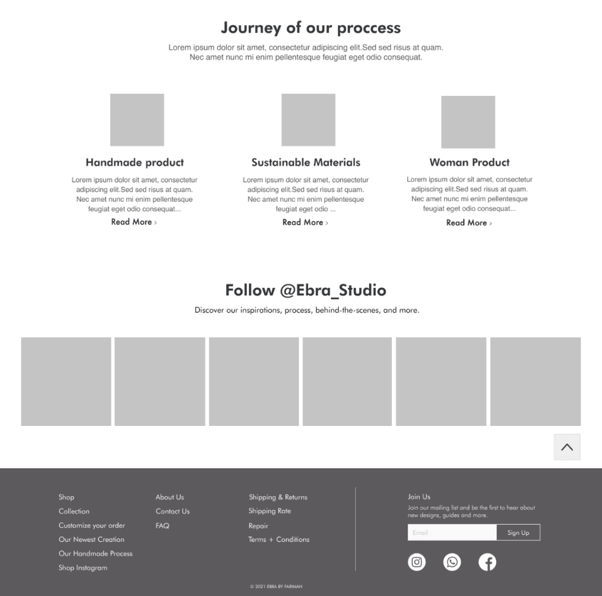
One of the significant challenges our team faced was categorizing the products. Before finalizing the information architecture, we identified four main product types, in addition to a special category for unique custom orders. Initially, we designed these four product categories as a secondary banner to ensure they were immediately visible to customers. This section was enriched with various micro-interactions to enhance user engagement and convey our passion for this project.
During our academic exploration, we delved into the needs of a diverse user base requiring specialized accessibility options for our website. Engaging with stakeholders led to a consensus on enhancing the site's accessibility features. Initially inclined to mimic a competitor's accessibility panel—a purchasable service aimed at augmenting accessibility in a style akin to certain reference images—we encountered a pivotal insight from our mentor. He illuminated a critical flaw: users with disabilities faced difficulties in navigating the competitor's system to find the appropriate accessibility profile. This feedback prompted a strategic pivot towards a design that emphasized intuitiveness and ease of use, mirroring the more accessible and user-friendly layout depicted in an alternate image, thereby prioritizing seamless accessibility for all users.
Ultimately, the team decided to incorporate a banner for the unique custom orders alongside the existing categories to draw more attention to this option, ensuring that users could easily find whatever product they were searching for. This addition marks the completion of our final design
Plugin Designed:

Our Minimal Design:


Moodboard

UI Kit
Reflecting on this project, I've gleaned pivotal insights. The shift towards micro-interactions proved transformative, enhancing user engagement significantly. This adjustment illuminated the crucial balance between functionality and user experience.
A profound realization emerged regarding inclusivity; understanding that approximately one billion individuals live with disabilities underscored the importance of accessible design. This insight shifted my perspective from mere compliance to a deeper commitment to respect and cater to all users' needs.
Questioning the status quo, particularly regarding accessibility solutions, was enlightening. It highlighted the necessity of pursuing approaches that genuinely meet users' needs rather than defaulting to existing, potentially inadequate solutions.
Looking forward, the project points towards further research into accessibility and the exciting potential of Augmented Reality (AR) for immersive product interactions. These directions promise to enhance user experiences and inclusivity, aligning technology more closely with user needs.
Reflection
Micro-interactions enhances user engagement.
Simplicity and subtle interactions significantly impact engagement.
Urges seeking solutions that truly meet user needs.
Valuing all users beyond adhering to accessibility standards.
Fostering inclusivity is crucial for around one billion people.
Future Steps
Looking ahead, the project points me towards two main directions. Firstly, there's a clear need to delve deeper into research and ideation around accessibility profiles, aiming to further refine and enhance the experience for users with disabilities. Secondly, if my involvement with the team continues, I'm eager to explore the potential of Augmented Reality (AR) for product interactions. This technology could revolutionize how users engage with products, offering an immersive experience that closely mimics physical interaction, thereby bridging the gap between digital and tangible experiences.
